
01 Oct 2015
Churning with Caret: Linear Models
I really enjoyed working through Max Kuhn and Kjell Johnson's Applied Predictive Modelling book- as well as a fantastic guide to applying predictive modelling techniques using R and the caret package, it has loads of exercises, and for the first half of the book some excellent worked solutions.
Sadly, for the classification chapters, there are no such worked solutions. As I'm feeling like I want to practice what I have learnt, I've decided to write about my solution to the churn modelling which pops up a couple of times. So here you go internet, see what you think, and let me feel your wrath if you disagree (preferably with constructive criticsm and helpful suggestions).
So here we go- how I tackled the churn dataset using linear models. I'll mention here and now- linear models can be VERY precious. They typically require a lot more preprocessing and consideration than robust non-linear models like tree based models (but on the flip side, they can be a lot more interpretable). Preprocessing steps can be a lot easier for non-linear models- as future blog posts will show!
I've put my script on my github for reference.
Overview
Churning is pretty interesting stuff in the big wide world of business (its got nothing to do with making butter in this context). Businesses like to retain customers. Sadly, sometimes customers like to leave (by switching providers, or just terminating contracts). As a business, how neat would it be if you could predict which customers are likely to churn? That would be pretty handy, as you could then irritate them by sending them discounts or promotions in a desperate bid to keep them. And on another train of thought- why would you want to offer tantilising promotions to customers who are going to stay with you anyway?
Companies tend to store a lot of infomation about their customers these days, enough so that predictive modelling can be used to accurately identify those customers at risk of churning.
The churn dataset I use is in the C50 package. It consists of a training and test set of predictive variables and their corresponding outcome. The predictors, or covariates, are a mix of continuous numeric, discrete numeric, and catagorical variables. The outcome, or dependent variable, is the binary churn outcome: yes or no.
One thing you will notice throughout this example is that as I move along preparing the training set, I do the exact same processing to the test set. This is VITAL so that the model built from the training data can be applied to the test data!
Data Exploration
This is such a key thing to do before anything else. I always start with a summary() of the data, or to use the Hmisc::describe() function. The outcome is key for classification- how balanced are the classes? For the churn training set, we see approximately 15% are churners. This percentage is roughly constant in the test set, which is a CRUCIAL thing- it would be dangerous to build a model on a training set of data that doesn't resemble the test set.
The class imbalance sets off a few warning bells as well- we can get roughly 85% accuracy purely by predicting all to be non-churners! This is called the no information rate, and is a threshold we need to aim to beat. The fact that there is such a big class imbalance means we need to think abut what metric we use to evaluate our models as well. The kappa statistic or sensitivity could be smart choices in this case. Overall accuracy, for example, may not be the best metric as the no information rate is already 85%
Well, we have had a look at the outcome, so what about the predictors? We should get visualising. I've writtem my own custom plotting function with ggplot2 that I've used here- I wil share it with the world once it is tidied up! I like to use it after I have split up predictors by integer, continuous and categorical.
I also quite like the caret::featurePlot() function, which can be used in a number of ways- I've used it for doing a scatterplot matrix to investigate between-predictor relationships.
So what are we looking for in these visualisations? It turns out they can give us a lot of hints about important predictors, redundant predictors, and risky predictors.
Lets start with the density plots for continuous numerical predictors.
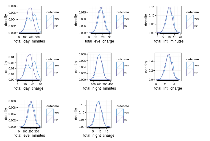
As you might guess, charges and minutes follow almost identical distributions. You would expect this if the day, night and evening minutes are charged at a constant rate. The caret::featurePlot() confirms this- there is an almost perfect linear correlation between them. Below, I've just pulled out one set of the corelated predictors as an example.
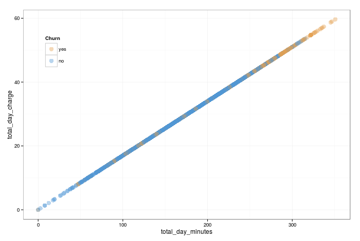
As we only need one to infer the information of the other, lets drop the charges (we could have equally dropped the minutes). There are more formally rigorous ways we could have diagnosed this collinearity, but we won't get in to that for now.
Another feature that looks interesting is that total day minutes has a bimodal distrubution for churners (although the modes arent well seperated). What does this tell us? Firstly, that there is a group of churners who are better seperated from non churners, which is good for building classification bounderies! The bad is that strictly speaking, we dont want bimodal distrubutions for linear models. We will leave it in for now as it isn't too bad (the two modes aren't seperated significantly)- but this is a feature nonlinear models will be fine with, and should be able to give us great results (to be discussed in a future blog post!)
One question is- what hints if a feature is important? Loosely speaking, as we want our models to build classification boundaries, any features where the classes are well seperated will be strong predictive factors. There are much more rigorous ways to diagnose variable importance, but that is a discussion unto itself!
Next, let's consider the count data.
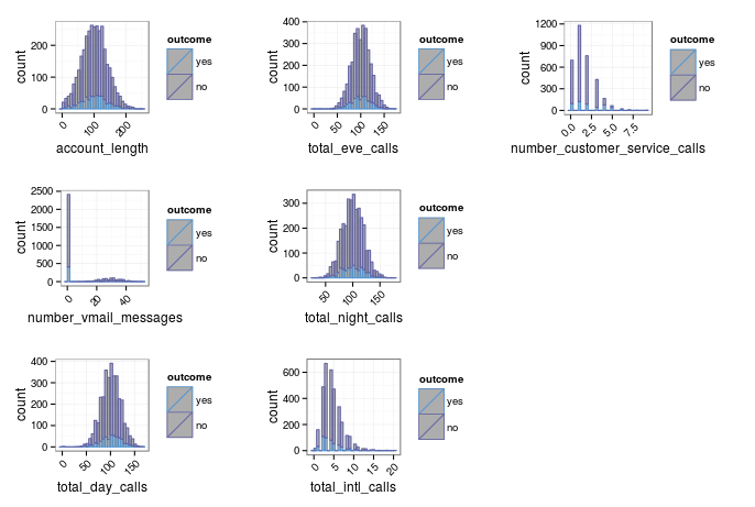
They seem fine, apart from a few snags. Firstly, the most worrying one is number_vmail_message. An assumption of linear models is that the predictors are normally distributed. This predictor certainly is not. It has a well seperated bimodal distrubtion where those customers with non-zero messages seem roughly normally distributed, but there is a second group where customers have none (presumably because they dont have voicemail activated). I spent a while scratching my head how to treat this. Common transformations like Box-Cox, or simpler strategies like taking logs or raising to a power do not help. Other strategies I saw online for similar data included reformatting it as a categorical variable. However, that doesnt sound legitimate to me as they are not categories- 10 messages is less than 20 and more than 5, and you lose this information by binning into groups. Further, the allowed values of customer service calls is not a pre defined set- allowed values are any integer. My solution for now is to remove this predictor. Tree based models, for example, will have no problem at all with a predictor like this, but I cant think of a satisfactory resolution for linear models.
The other thing I want to address is the skewness of some of the distributions. Transforming skewed variables will hamper the interpretabiliy of model coefficients, but it may improve the overall quality of linear models. caret has many funky preprocessing options, but I'm just going to do a simple transformation, taking the square root. Testing the skewness after this, it seems much better. e1071::skewness() can be applied across the predictors with a simple vapply().
The final set of predictors to investigate are the categorical ones.
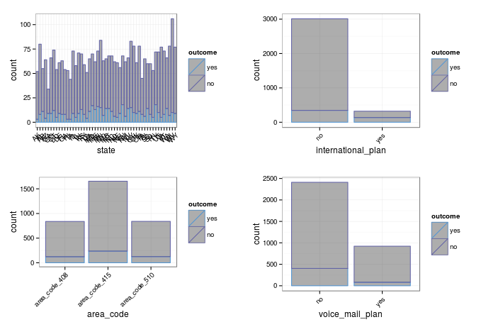
For binary categories, its common to investigate the odds ratio, for which you can use Fisher's test:
intPlanTab <- table(churnTrain$international_plan, churnTrain$churn)
fisher.test(intPlanTab)
Where there are more than two categories, a chi-squared test can be used to calculate a p-value for association.
I get warnings when running a chi-squared test for the customer's state- my guess is because there are too many levels. For the time being, I'm going to keep all the categorical predictors.
Dummies
So that categorical predictors can be used in a range of models, we have to manually convert them to dummies (the stats::lm() function does this internally, which is why you may have never seen it before). caret can transform to dummies easily, using caret::dummyVars(). After dummying up, we abandon facCols, and continue the analysis with facTrans.
catDummies <- dummyVars(~. , data = facCols)
facTrans <- data.frame(predict(catDummies, facCols))
One thing we have now done is introduced colinearity. For example, with interational_plan, we now have two columns- one for yes and one for no. However, we only need the information from one to directly infer the other. In general, we will always have one redundant column for each categorical predictor when building dummy variables. I think it is arbitrary which you throw away, but for models that are effected by colinearity, you need to ditch one! subselect::trim.matrix() makes this process nice and easy:
#
# build covariance matrix, and apply
# subselect::trim.matrix()
reducedCovMat <- cov(facTrans[, ])
trimmingResults <- trim.matrix(reducedCovMat)
#
# see which discarded and then subset facTrans
#
badNames <- trimmingResults$names.discarded
facTrans <- facTrans[, !names(facTrans) %in% badNames]
One thing to check now is for zero variance, and near zero variance predictors. Zero variance predictors offer no useful information, and near zero variance predictors may be unsuitable for use in linear models. I was suspicious of this for the state category. As there are so many catergories, only a few samples are from each state. Some linear models may be adversely effected by predictors like this. The caret::nearZeroVar() function allows us to easily check, and pull out the names of the guilty columns:
isNZV <- nearZeroVar(trainInput, saveMetrics = TRUE)
names(trainInput[, !isNZV$zeroVar])
names(trainInput[, !isNZV$nzv])
Upon checking, all the state predictors have near zero variance. Let's just make a mental note for now- we will certainly have to filter these for linear models that do not have built-in feature selection.
Interactions
As decision boundaries aren't neccesarily linear, one trick is to include interaction terms. I'm going to do this up to the second order with for all numerical predictors. I'm not going to worry about the sentiment of combining count data with continous data, however I won't include the dummied categorical (due to bimodal distributions that will be produced). I wrote a custom function to do this, feel free to pinch it!
quadInteraction <- function(df) {
  #
  # setup
  #
  numericCols <- vapply(df, is.numeric, logical(1))
  dfNum <- df[, numericCols]
  nCols <- ncol(df) + choose(ncol(dfNum), 2) + ncol(dfNum)
  out <- data.frame(matrix(NA, nrow = nrow(df), ncol = nCols))
  out[1:ncol(df)] <- df
  names(out)[1:ncol(df)] = names(df)
  #
  # calculate interactions
  #
  start <- 1
  dfPosition <- ncol(df) + 1
  for(i in 1:ncol(dfNum)) {
    for(j in start:ncol(dfNum) ) {
      out[dfPosition] <- dfNum[i] * dfNum[j]
      names(out)[dfPosition] <- paste(names(dfNum[i]),
                                      names(dfNum[j]),
                                      sep = '|X|')
      dfPosition <- dfPosition + 1
    }
    start <- start + 1
  }
  #
  # return output
  #
  out
}
Note that you do not have to do this for non-linear models, as by definition they can explore non-linear classification boundaries!
Now I have a complete set of predictors- dummied up categorical, and numerical with interaction terms. I stick them all together into one data frame, imaginatively called trainInput. Remember I followed along the training set processing with the test set- so I have testInput as well, which has been processed identically.
Filtering
What I call filtering is in fact unsupervised feature selection- that is, I wont consider the relation between the predictor and the outcome in the selection process (supervised feature selection is another story for another time). Some models can internally perform feature selection, and for those I can feed in the full set of predictors (all 119 of them). Others, like logistic regression or linear discriminant analysis models cannot, and will be seriously hampered by poor sets of predictors.
First, we want to remove near zero variance predictors from our reduced set. In this case, this means the state dummy indicators. Next, we want to investigate those highly correlated, and remove them. caret has a built in function to do this- read the documentation on caret::findCorrelation(). I define high correlation as those with a correlation of over 0.9 to be filtered from my reduced set, and those which are fully correlated should be removed from even the full set.
I like to use a trick from the Applied Predictive Modelling book, and store a character vector of variable names for fullSet and reducedSet, so that I can subset the trainInput data frame accordingly.
# look for zero and near zero variance, and
# make a character vector for the names of the
# predictors to include in the full and reduced set
#
isNZV <- nearZeroVar(trainInput, saveMetrics = TRUE)
fullSet <- names(trainInput[, !isNZV$zeroVar])
reducedSet <- names(trainInput[, !isNZV$nzv])
#
# look at between predictor correlations, and filter
# with different cutoff for full and reduced set
#
trainCorr <- cor(trainInput)
highCorr <- findCorrelation(trainCorr, cutoff = 0.9)
fullCorr <- findCorrelation(trainCorr, cutoff = 0.99)
highCorrNames <- names(trainInput)[highCorr]
fullCorrNames <- names(trainInput)[fullCorr]
#
# remove appropriately from the full and
# reduced set.
#
fullSet <- fullSet[!fullSet %in% fullCorrNames]
reducedSet <- reducedSet[!reducedSet %in% highCorrNames]
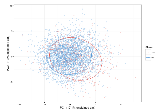
What I like to do once I have the predictor sets is to do a PCA plot to investigate the decision boundaries. The ggbiplot::ggbiplot() function does this exceptionally well. This graph (for the reduced set of predictors here) can give us some intuition of how well seperable the two classes are... and the significant overlap suggests that its going to be challenging to predict many of the churners from the non-churners using linear models.
Models
Max and Kjell's book explains the models I'm going to be using and the training process better than I ever could- either check it out or the caret website.
The caret::train() function provides a consitent interface to masses of regression and classification algorithms, and amongst (many) other things it takes care of resampling and preprocessing, the feeding in of tuning parameters, and defining the summary statistic you wish to use to select your model.
The models I will use are: a generalised linear model (logistic regression), a linear discriminat analysis, partial least squares discriminant analysis, glmnet, and penalised LDA. The latter two have built in feature selection capabilities, and will be fed the full set of predictors. The others will use the reduced set to ensure the models peform well.
An example of using caret::train() is this:
# use trainControl() to specifiy training control options.
# we use 10 fold cross validation, repeated 5 times.
# we want class probabilities AND class predictions to be
# reported.
# The summary function will calculate the area under the
# ROC curve, sensitivity, and specificity for the resamples
# predicting on the holdout set
#
ctrl <- trainControl(method =
repeatedcv
,
number = 10,
repeats = 5,
classProbs = TRUE,
savePredictions = TRUE,
summaryFunction = twoClassSummary)
#
# set seed for reproducibility
#
set.seed(476)
#
# for plsda, there is one tuning parameter, which is passed
# in with tuneGrid
# preProc: set the preprocessing to center and scale predictors
# probMethod: an argument specific to the plsda model
# metric: set the training process to select the model with highest
# sensitivity
# trControl: pass the train control options we specified in ctrl
#
plsdaTune <- train(x = trainInput[, reducedSet],
y = trainOutcome,
method = pls
,
tuneGrid = expand.grid(.ncomp = 5:20),
preProc = c(center
, scale
),
probMethod = Bayes
,
metric = Sens
,
trControl = ctrl)
First, I define caret::trainControl(). This sets up the training options- here I have defined the resampling strategy, and that I want the probabilities and class predictions to be saved. Also, I define the summary report to include the default twoClassSummary, which is the area under ROC curve, the sensitivity and the specificity. When fitting the model with caret::train(), I preprocess all the data by centering and scaling the predictors- this is a typical trick to improve stability with this class of model. I chose to select the final model by the one which achieves the highest sensitivity, that is, the true positive rate. I train over the number of components for plsda (the training parameters are often specific to the model at hand). Other model-specific arguments can be passed; in this case probMethod = Bayes
is specified.
caret is also uber helpful when it comes to evaluating models. The print generic summarises the resampling over the tuning parameters. The process I use is to examine the resampling results, plot them (there is a plot generic for objects of class train, so for a model called 'model' just type plot(model)) and make sure they seem reasonable.
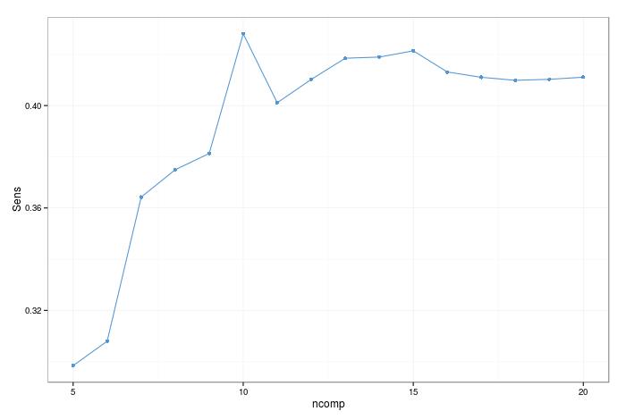
As mentioned, to choose the model parameters for the final model, I select the one which gets the highest sensitivity. That being said, there is a fairly large standard error in this case, so there are arguments for chosing the simplest model which is within one standard error of the best (caret allows you to make this choice- see ?caret::trainControl()).
With fitted models, there is a predict() generic function, so we can predict on our test set. Then, with the known outcomes of the test set, we can get the confusion matrix for the test set peformance using caret::confusionMatrix(). Remember, the test set was not used at all in model building, so we hope that it is representative of how the model will peform in the wild.
# obtain class and probability predictions for the
# test set
#
plsdaPred <- predict(plsdaTune, newdata = testInput[, reducedSet])
plsdaPredProb <- predict(plsdaTune,
                         newdata = testInput[, reducedSet],
                         type = prob)
#
# confusion matrix for the test set
#
confusionMatrix(data = plsdaPred, reference = testOutcome)
The caret::confusionMatrix() function is pretty handy, as it reports a bunch of statistics as well as just a confusion matrix (which can trivially be made with the base R table() function).
Variable Importance
For these models, we are focussing on predictive power rather than interpretability- but it is often useful to get some insight as to which are the most important variables. If collection of data is expensive, you would want to focus on those predictive factors that give you the most information, and include them only in your model.
Variable importance can be a complex topic, and different models may find different features to be more important (indeed, the variable importance is calcualed in different ways). I will defer an in depth discussion to the relevent chapter in the APM book, and just demonstrate how to extract a variable importance plot using caret:
# scale between 0-100 and select only the top 10
#
plot(varImp(plsdaTune, scale = TRUE), top = 10)
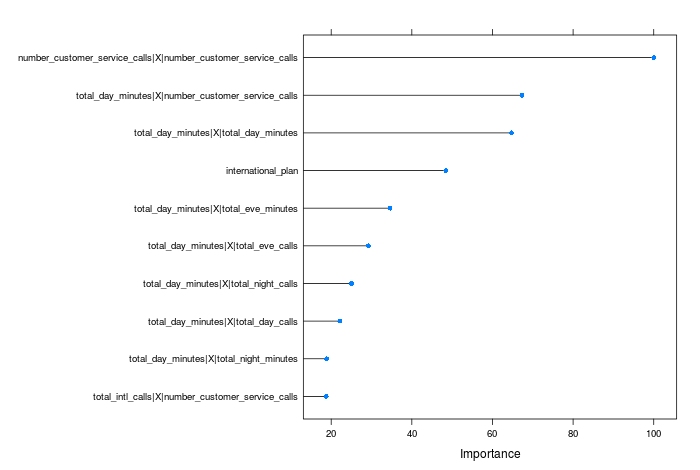
All of the variables are ranked relative to the top predictor in this case.
Model evaluation and comparisons
This can diverge into an in depth dicussion, so I will keep it short here. We have two measures of model accuracy- from the resamples while training, and from the test set. One issue with ranking the models purely by test set accuracy is that the test set may not be fully representative of the data the model will encounter. Further, an argument is that the data in the test set could have been used to strengthen the model by adding more training data- and if resampling is done proeprly, we should be able to use the resampling results as a measure of model accuracy.
Lets look at the resamping results first. Remember we did 10 fold cross validation, with 5 repeats (and this proocess is repeated for each tuning parameter, hence the amount of time it takes to train some models). Therefore, we can plot a distribution of the model peformance in the test set for the optimum tuning parameter, where the model is built on 9 folds, and evaluated on the hold-out set (see Applied Predictive Modelling for a more in-depth discussion of resampling).
To visualise the resampling perfomace, I like the following approach:
# first build a list of train objects
#
models <- list(glm = glmTune,
               lda = ldaTune,
               plsda = plsdaTune,
               glmnet = glmnetTune,
               penlda = penldaTune)
#
# use caret::resamples with lattice::bwplot()
#
bwplot(resamples(models))
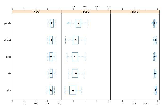
The boxplots show the distributions of the metrics we evaluated when building the models, and here you can use statistical testing to compare models, should you like. The rule of thumb is if you are chosing between two models that arent statistically significantly different from one another in terms of results, then always chose the simplest one.
We can also look at the test set, and analyse some properties of our model prediction. Obviously, the simplest thing to do is to order the results in terms of peformance- we wanted to maximise the sensitivity, and on the test sets glm scored 0.33, lda scored 0.375, plsda scored 0.388, glmnet scored 0.446, and penalised lda scored 0.455. Clearly, the penalised methods were superior in peformance, and we would choose penalised lda as the winner both for the resample results and the test set results. All the models outperform the no-information rate- that is, they are all informative
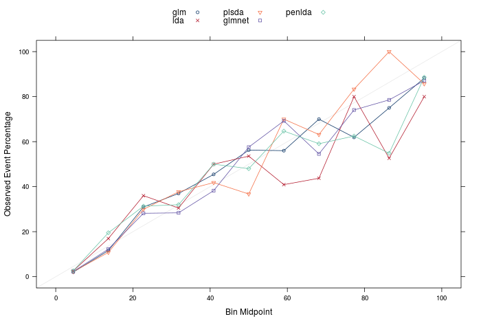
The final two things I want to present are the calibration and lift plots. Firstly, calibration plots can tell us if the calculated probabilities are well calibrated- that is, if I predict 10 samples to be 90% likely to be a churn, I would expect that 9 of them are churns, and 1 is a non-churn. The plot below shows the calibration plots for all the models, and they seem reasonable, if not totally perfect. Should the models be perfectly calibrated, the points in the plot would lie on the identity line. There are techniques you can apply to recalibrate the probabilities calculated by a model if they are poor, however that is another discussion for another time.
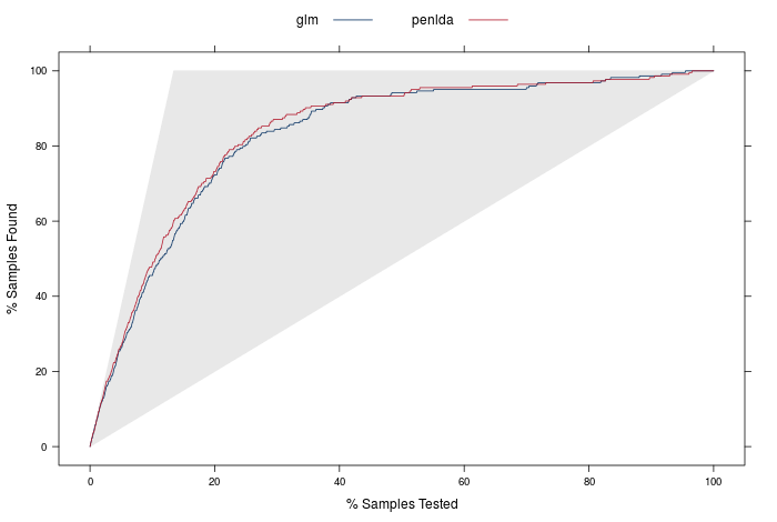
The lift curves are the final model evaluation tool I will discuss. The idea with these is to firstly order all the predictions in the test set by prediction probability of churn (remember p(churn) + p(no churn) = 1, and we define a churn if p(churn) > 0.5). One question would be is: if we took our n most confident predictions for a churn, how many of the the churners would we have found? A perfect model, for example, with 10 churners and 90 non churners would have the 10 churners with p(churn) > 0.5, and 90 non-churners with p(churn) < 0.5. If we were to order from the largest to smallest p(churn), we would only need the top 10% of the ordered samples to identify all the churners.
The lift curve displays exactly this: it orders the samples from highest to lowest probability of churning (or whatever the 'positive' outcome is), and then plots the percentage of samples found vs the percentage of samples tested.
The plot below is a lift curve for the strongest and weakest model we just built. The identity line would represent a totally non-informative model, and a perfect model would follow the shape of the upper edges of the grey triangle.
caret has built in functionality to produce both these plots, which can be built with the syntax:
#
# The calibration curve can be created with this syntax
calCurve <- calibration(class ~ glm + lda + plsda + glmnet + penlda,
                        data = results)
xyplot(calCurve,
       auto.key = list(columns = 3))
#
# The lift curve can be created wit this syntax
#
liftCurve <- lift(class ~ glm +  penlda, data = results)
xyplot(liftCurve,
       auto.key = list(columns = 2,
                       lines = TRUE,
                       points = FALSE))
Summary
I think its time to wrap up now! There's definitely a lot more that could be discussed, but I will save that for another time. To answer the final question in the excercise in the chapter of Applied Predictive Modeling- how many test samples do we need to identify 80% of churners? Our best model is penalised LDA, and we can read off the lift curve that for 80% of churners, we would need to contact about 23.7% of total (obviously we would select the 23.7% with the highest probability of churn). We would hope to expect that these results would apply to future data sets, where the test outcomes may not be available (it could be 'live' data, where customers at risk of churn are trying to be identified before it happens.)
In other words, when selecting 23.7% of the total in the test set which we are most confident contains churners (0.237 * 1667 = 395 samples), we have identified 80% of the total churners (0.8 * 224 = 179). This type of result would allow far more informative business decisions as to who are the customers to reach out to, avoiding needlesly contacting many customers who are at little risk of churning. If these results apply to new data, we would expect to contact roughly 18% of non-churners in the process of reaching 80% of churners.
Next time I will apply a set of non-linear models to the same data to see how they peform, and to see if I can beat this. The models are more complex and less interpretable, but can be very powerful, and also the preprocessing steps can be a little more simple!
TL;DR- I did some churn modelling, using linear models. If you want my script of how I did it, it is here